
DIVERSITY · HEALTHCARE · LONDON
Visual landmarks create recognition in a complex healthcare environment.
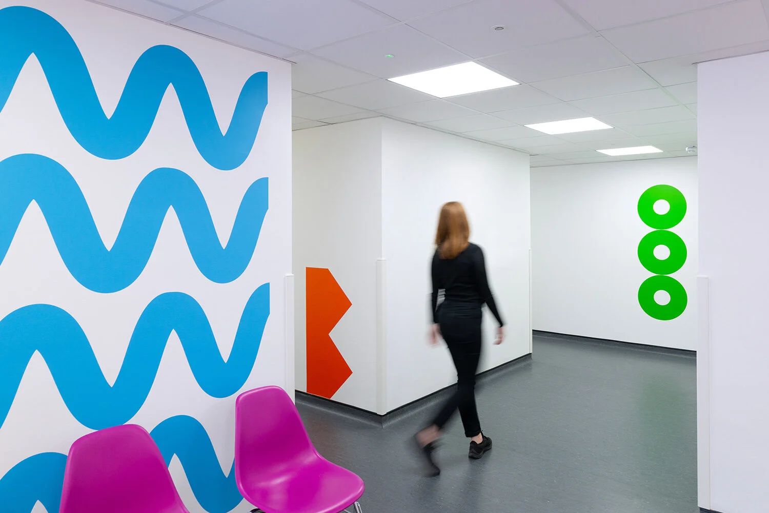
A connected family of colour, pattern and geometric forms helps patients, visitors and staff recognise their surroundings across a busy two-storey clinic.
THE CHALLENGE
Make a large, visually uniform hospital easier to navigate.
The refurbished Ambrose King Centre serves a large multicultural community with varied backgrounds and accessibility needs. Around 40,000 patients use the clinic each year.
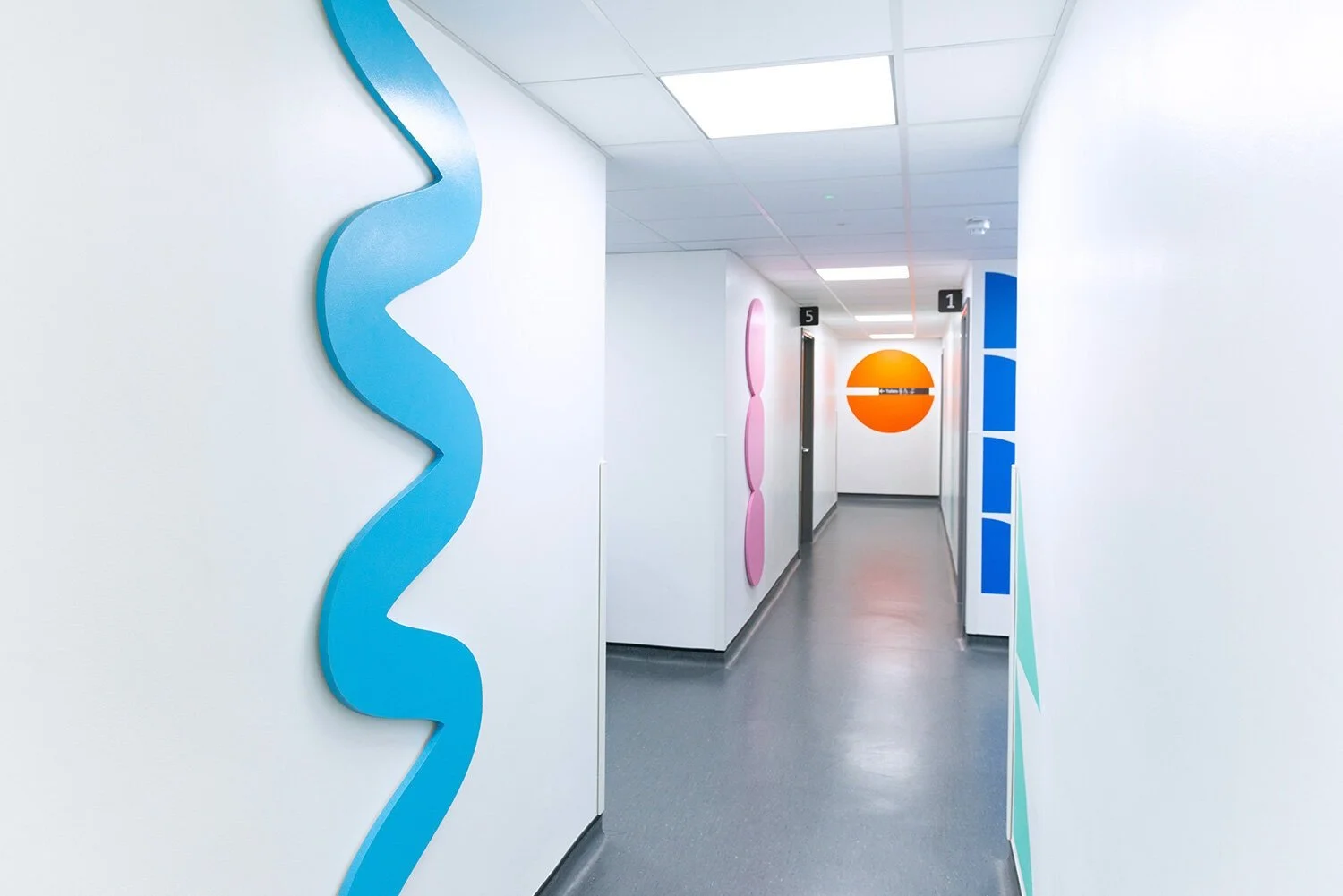
Four similar corridors extend across two floors, connecting reception, consulting rooms and five waiting areas. Without distinctive visual reference points, the institutional environment could feel monotonous and disorientating—particularly for patients who may already be anxious or vulnerable.
OUR RESPONSE
A visual family that repeats, changes and guides.
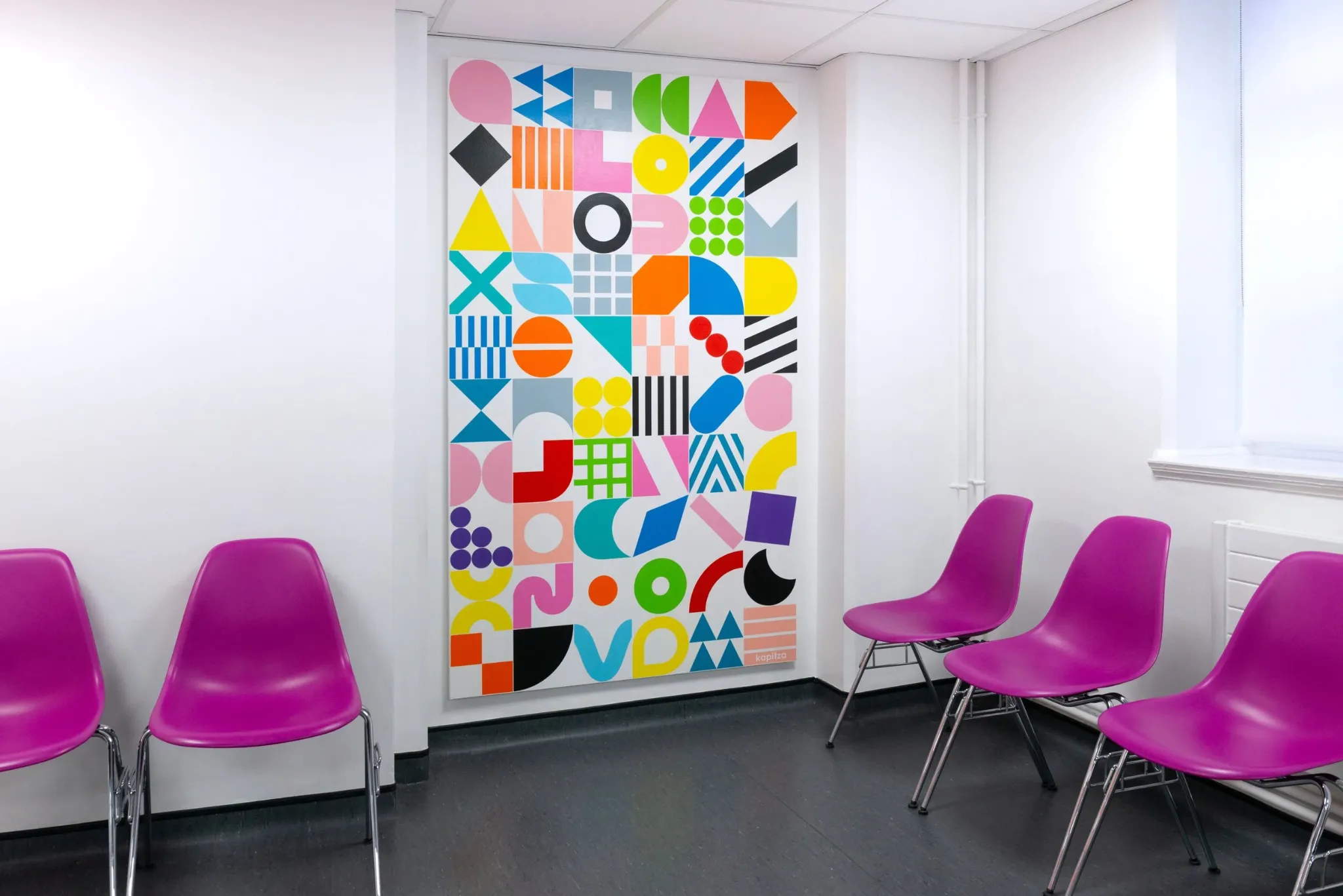
We created a large central painting for reception, composed from a language of abstract geometric symbols. It establishes the project’s palette and acts as the key to the wider system.
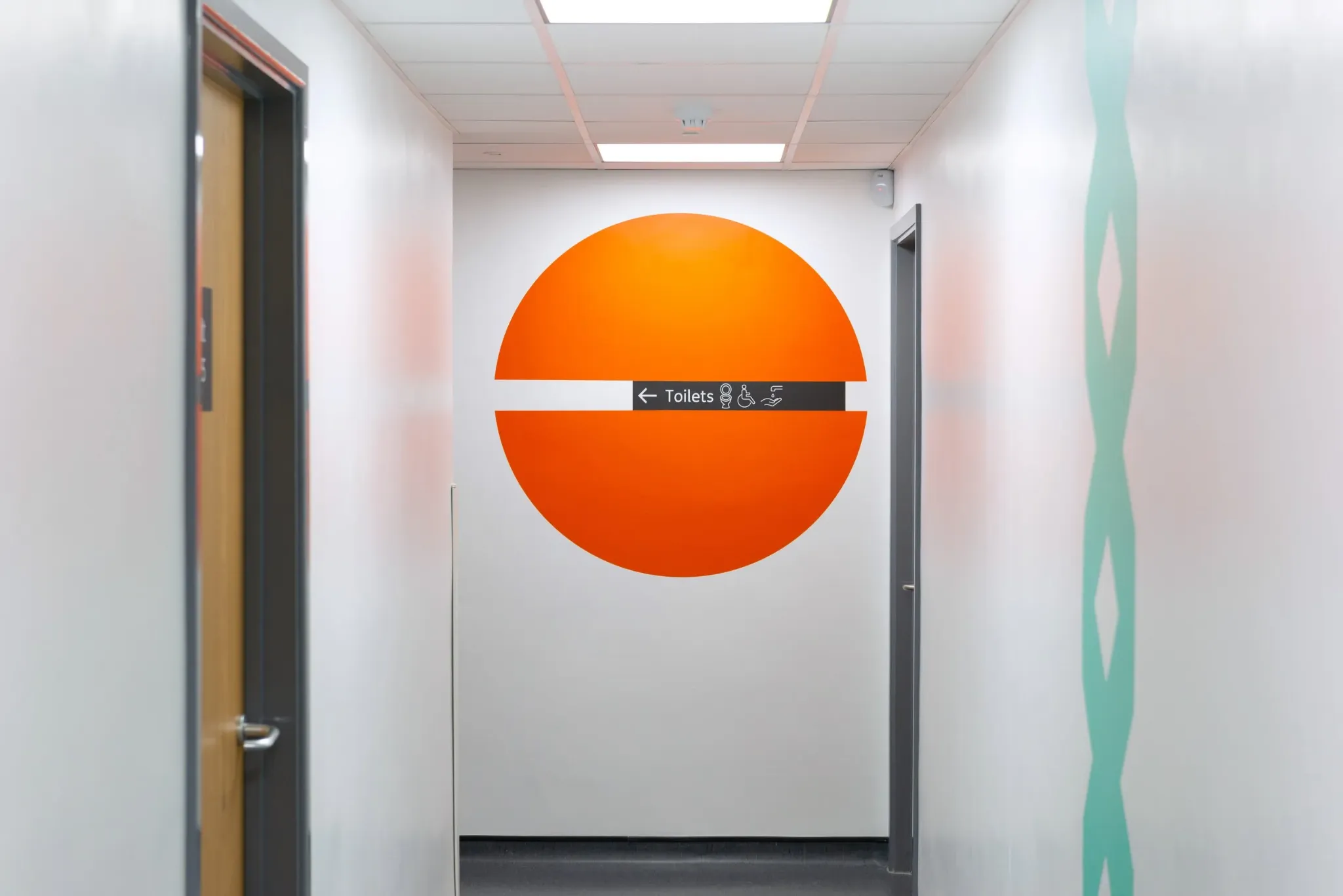
Shapes and colours reappear through painted walls, window and wall vinyl, wooden artworks and framed prints. Each area has its own composition, while recurring elements build recognition and continuity throughout the clinic. Artwork on the reception glazing also provides privacy from the public entrance.
VALUE FOR THE ENVIRONMENT
Orientation, identity and wellbeing in one system.
Distinctive colour and form give patients, visitors and staff memorable points of reference across otherwise similar spaces. The system complements necessary signage while reducing the institutional character of the clinic and creating a more engaging, welcoming environment.
OUR SCOPE
One visual language across multiple materials.
- Colour + visual wayfinding system01
- Reception landmark artwork02
- Wall graphics + privacy window vinyl03
- Wooden artworks + framed prints04
- Application across two clinical floors05
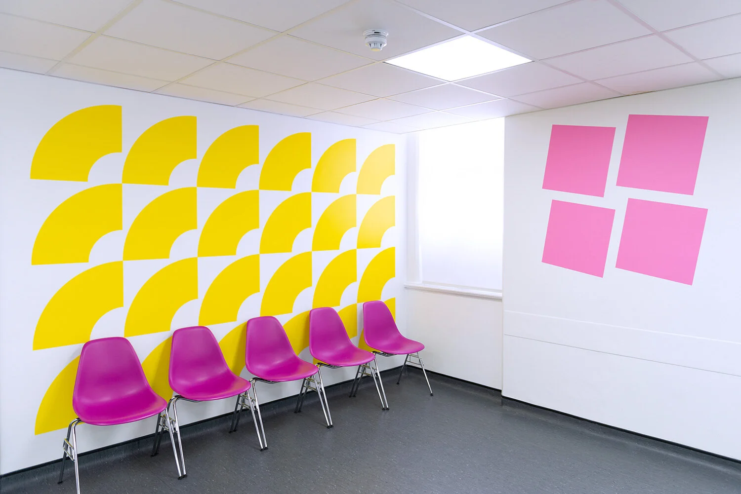
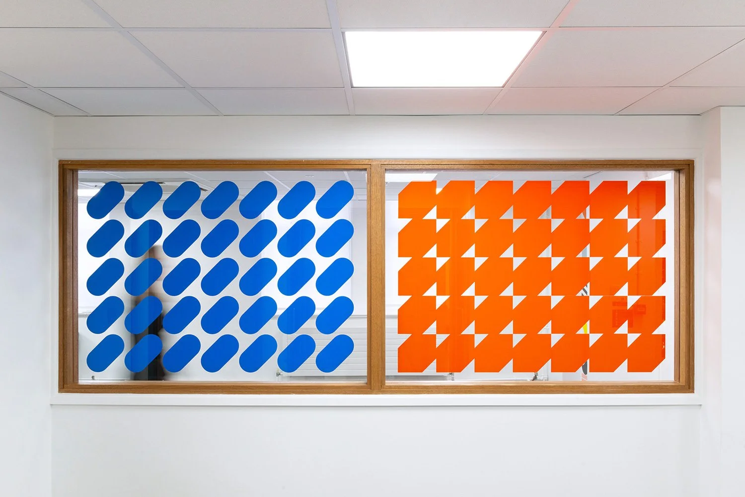
Project created by Petra and Nicole Kapitza, founders of COLOUR FORM SPACE. Photography © Owen Richards.
START A CONVERSATION
Could colour and form make your healthcare environment easier to understand?
Tell us about the building you are planning or improving. We can explore how a visual system could support patients, visitors and staff.
Talk to us